I was struggling to envision my manuscript as a real book, so I decided to make a hardcover copy of the book. In doing so, I remembered my love of bookmaking and decided I wanted to take this project on, building on experiences I had in bookmaking prior.
Previous bookmaking projects were largely collaborative, done in conjunction with local artists and writers. I was able to build on those experiences in determining what was possible for this book. The primary difference is that this would be my first full-length poetry book consisting of only my work.
I opened preorders for the book in the Spring of 2024, thinking I'd release it in the fall of that year. Not so. That said, preorders were a fantastic way to motivate me to complete the book. Were I to do this again, I would still open preorders but allow for more time. Better to be early than late.
Further, I would also schedule a release date and nail down a venue and all that sooner, because of the principle of how work expands to fill the container it is given.
Lessons Regarding Preorders:
Despite what I said in Lessons Learned from Self-Publishing, I did scope out my materials before starting, for the most part. I looked at what the most common French Paper Co. sizes were, and determined which coverstock I'd likely purchase. I also checked out paper from Church Paper Co. for the bookblock, but ultimately decided to go with paper that Cheetah Printing had in stock as it laid flatter than the paper I got from Church paper.
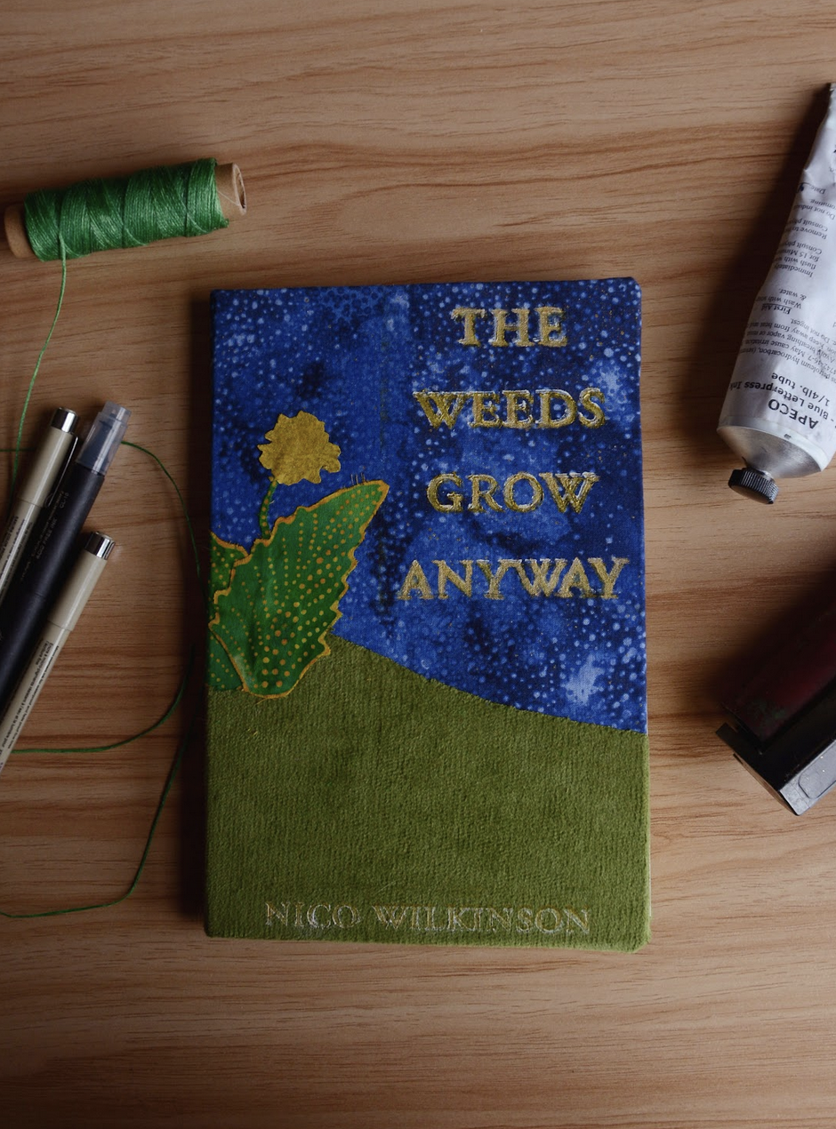
I initially planned to perfect bind the book using my perfect binding machine which scores the spine, runs glue over it, and then squares the cover paper around the spine. However, I didn't love how the spine was looking, and pages were falling out. So I decided to bind the books in a single signature using a saddle stitch.
If I'd added additional signatures, that would have increased the binding time exponentially. To keep the book accessibly priced, I strove to stick to one signature. It does mean the book was more difficult to press.
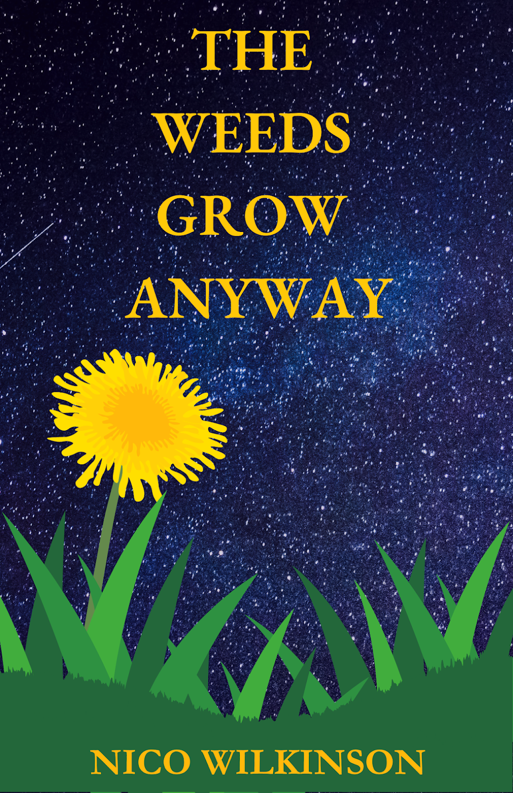
I knew I could go a few routes to print the cover -- digital, set type, etc. But I love linocut and I wanted to get more experience in creating a multi-layer design. You can digitally print the cover or use other methods, such as linocut, typesetting, and more. I designed the cover on graph paper, edited it in Procreate, and then used transparent paper to separate the layers and transferred those layers to separate pieces of lino. I did not go the reduction route, as I was worried about making an error.
I printed the yellow layer using riso, because riso is particularly good at creating such a bright color. I also worried about the risk of contamination changing the color if I printed this layer in lino.
I printed the green layer in green, and then the blue/black layer after that.
I designed the bookblock using Adobe inDesign. The subscription cost was one of the biggest expenses. I recommend, if you have the option, to find a program you can buy outright and master it before you have a deadline. Affinity Publisher is one such option. You can buy a lifetime license.
Editing took a long time because of perfectionism.
What I would do differently: